
Data mapping with Vector Tiles and Mapbox GL, part 1
 Click to open the quake map
I've been fascinated by vector tiles for a while now, but until recently I had no idea how they worked. All I knew was that you can style some stuff in Mapbox Studio, upload it to their service, and you magically have a map.
As much as I love the guys at Mapbox, they have a limit on file sizes for free accounts, and I wanted to make a map with a bunch of data. Having a perfectly fine server myself, I went to sort out hosting vector tiles the way I'm used to with TileMill.
Before, you would style data in TileMill, generate an mbtiles file, and use a program to output a bunch of images to your server or S3 bucket. Then you tell your mapping library of choice -- mine is Leaflet -- to use the tiles at http://tiles.myserver.com/{z}/{x}/{y}.png.
Turns out, in many ways, vector tiles are faster and easier than using raster tiles. Especially when you're serving up a bunch of data, such as every census tract in the US.
What is a vector tile?
I don't want to get too technical, because I'd probably be wrong, but you can think of a vector tile as spiritually simimlar to an image tile. Instead of pre-rendered and styled roads, parks, etc., each vector tile is a compressed binary file containing all of the actual data needed to render the area it represents.
Getting started: Adding a GeoJSON layer as a vector data source
Before we get to serving up custom data from our server, let's start out with something familiar. One of the first TileMill tutorials is creating a simple map of earthquakes using the USGS's GeoJSON feed.
If you follow that tutorial, you'd render out your tiles, upload them somewhere, and serve them up. Easy but time-consuming.
Thankfully, Mapbox GL can use geojson as a data source. Let's do the same exercise here, but use the Mapbox library to render and style earthquake data on the fly. The first thing you'll need to do is sign up at mapbox.com and get an access token. Once you do that, head over to the initial example and copy it out. They auto-insert your access token in the example. It should look something like this:
<!DOCTYPE html>
<html>
<head>
    <meta charset='utf-8' />
    <title></title>
    <meta name='viewport' content='initial-scale=1,maximum-scale=1,user-scalable=no' />
    <script src='https://api.tiles.mapbox.com/mapbox-gl-js/v0.12.0/mapbox-gl.js'></script>
    <link href='https://api.tiles.mapbox.com/mapbox-gl-js/v0.12.0/mapbox-gl.css' rel='stylesheet' />
    <style>
        body { margin:0; padding:0; }
        #map { position:absolute; top:0; bottom:0; width:100%; }
    </style>
</head>
<body>

<div id='map'></div>
<script>
mapboxgl.accessToken = '<api key>';
var map = new mapboxgl.Map({
    container: 'map', // container id
    style: 'mapbox://styles/mapbox/streets-v8', //stylesheet location
    center: [-74.50, 40], // starting position
    zoom: 9 // starting zoom
});
</script>

</body>
</html>
Save it as earthquakes.html and open it in your browser. It's pretty, right? Zoom about, watch the labels scale and the roads fade in and out at different zoom levels. If you inspect the stylesheet , you'll see a very detailed JSON file outlining how to style the whole world at different zoom levels.
We don't need to understand all of this now. In fact, we're going to leave a default Mapbox layer as our base layer and toss some data on top of it, just like if we were creating a normal Leaflet or Google Map.
Sources, layers and sprites.
Let's define a few terms in Mapbox GL-land:
- Sources refer to a data source you'll be stying. They can be vector tiles, raster tiles, geojson, a background color, lines, fills (polygons), circles or videos (yes really). Sources are similar to TileMill's concept of a 'layer'.
- Layers refer to a slice of data you want to style. Each layer contains instructions on how some data from a specific source should look. You can use a layer to style all features in a source with one brush, or use filters to create layers for different categories of data. If you want to create one dot that's red, and one dot that's blue, you will need to create a separate layer for each color.
- Sprites are images you can use to style symbolic data. These can be things like a highway shield or, in our case, circles that we can color and scale as we wish. With Mapbox GL, you need to point to a root URL that contains image and metadata for sprites. Then you can use images by name in your layers.
What we need to do to get our earthquakes on a map are:
-
Create a source referencing the earthquakes data
-
Create a layer to style the points
Now let's go ahead and add our data to the map.
<!DOCTYPE html>
<html>
<head>
    <meta charset='utf-8' />
    <title>Earthquakes Map: Last month</title>
    <meta name='viewport' content='initial-scale=1,maximum-scale=1,user-scalable=no' />
    <script src='https://api.tiles.mapbox.com/mapbox-gl-js/v0.11.4/mapbox-gl.js'></script>
    <link href='https://api.tiles.mapbox.com/mapbox-gl-js/v0.11.4/mapbox-gl.css' rel='stylesheet' />
    <style>
        body { margin:0; padding:0; }
        #map { position:absolute; top:0; bottom:0; width:100%; }
    </style>
</head>
<body>

<div id='map'></div>
<script>
mapboxgl.accessToken = '<api key>';
var map = new mapboxgl.Map({
  container: 'map',
  style: 'mapbox://styles/mapbox/streets-v8',
  center: [-96,37.8],
  zoom: 3
});

map.on('style.load', function() {
   map.addSource("quakes", {
       "type": "geojson",
       "data": "http://earthquake.usgs.gov/earthquakes/feed/v1.0/summary/all_month.geojson"
   });

   // Once you have a datasource defined, you need to add a layer from that data source to the map.
   // We could, for example, add only earthquakes magnitude 4.0+. Here we just tell it
   // to take all of the data and style it as a circle.
   map.addLayer({
     "id": "quakes", // An id for this layer
     "type": "circle", // As a point layer, we need style a symbol for each point.
     "source": "quakes", // The source layer we defined above
     "paint": {
         "circle-radius": 10,
         "circle-color": "#ff0000"
     }
   });
});
</script>

</body>
</html>
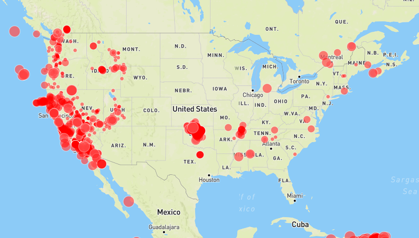
Save it, open it up in your browser. You should see something like this:
Let's break this up and take it function by function:
-
map.on('style.load', function() {...} )We only want to add our geojson to the map after the initial styles have loaded -
map.addSource("quakes", { ... })Adds a new source to our map and calls itquakes. We can use a geojson URL as a datasource. This doesn't do anything visible -- if you comment out the call tomap.addLayer, you would notice no earthquake data on the map. -
map.addLayer({ ... })Adds a new layer to our map with an id ofquakes. This is what renders the pints. We could call it anything as long as it references the rightsource.
Why is this cool? Well, that's more than 8,000 points rendered on the fly. Zoom in and out and see how smooth it all is. Last time I used Leaflet to throw a few thousand points on a map, performance was sluggish at best.
Let's make one more change. Let's give the circles a little opacity so that clusters of overlapping points show up brighter than individual ones. After "circle-color", add "circle-opacity": 0.2 so that our paint block looks like:
"paint": {
    "circle-radius": 10,
    "circle-color": "#ff0000"
    "circle-opacity": 0.2 // Give it a little transparency
}
Don't forget to add a comma after circle-color or you'll get an "unexpected string" error in your javascript console.
Functions
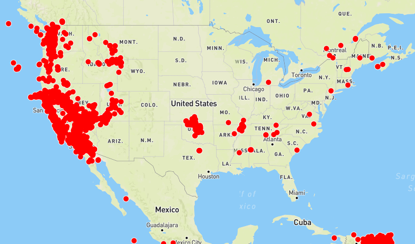
That's a little better, but when you zoom in some symbols are a little too transparent. This is a good time to bring up a powerful feature of Mapbox GL called functions. Essentially, a function lets you define different values for a property at different zoom levels.
The nice thing about some functions is that they're interpolated. That means if you only define a start and end value, the library will figure out the value of any other stop along the way. This is linear by default (so if you define a function [[1,1], [3,3]] the value for zoom 2 will be 2), but you can change the exponential base value to increase faster toward the high end.
In this instance, we want to have a transparent value at far zoom levels, but make the circles more opaque as we zoom in so we can see individual ones better. Let's give it a shot. Now make paint look like this:
"paint": {
    "circle-size": 10,
    "circle-color": "red", // Color our circle red.
    "circle-opacity": {
        "stops": [[3, 0.2], [15,0.8]] // Gives us interpolated values between 0.2 and 0.8
    }
}
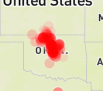
Now when we're zoomed out, a cluster in Oklahoma (at the time I wrote this anyway) looks like this:
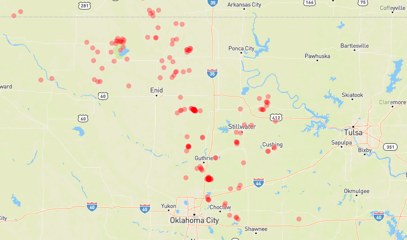
And when we're zoomed in, you can see detail on the individual dots:
Filters: Conditional styling
As of now, all earthquakes look about the same. We know thats not true: the Richter scale is logarithmic, increasing exponentially in power at each level. We can try to convey the difference in size by giving each magnitude a different icon-size.
The only way right now to style different icons based on their attributes is to set up different layers with different filters. A filter lets you define how a subset of data it matches will look. Thankully, the USGS feed gives each earthquake a mag property we can use for filtering.
So we could, for instance, create a layer for each magnitude between 0 and 1, 1 and 2, 2 and 3, etc. That would look something like:
map.addLayer({
    "id": "quakes-0",
    "type": "circle",
    "source": "quakes",
    "filter": ["all", [">=", "mag", 0], ["<", "mag", 1]],
    "paint": {
        "circle-radius": 10,
        "circle-color": "#ff0000",
        "circle-opacity": {
            "stops": [[3, 0.2], [15,0.8]] // Gives us interpolated values between 0.2 and 0.8
        }
    }
 });
map.addLayer({
    "id": "quakes-1",
    "type": "circle",
    "source": "quakes",
    "filter": ["all", [">=", "mag", 1], ["<", "mag", 2]],
    "paint": {
        "circle-radius": 15,
        "circle-color": "#ff0000",
        "circle-opacity": {
            "stops": [[3, 0.2], [15,0.8]] // Gives us interpolated values between 0.2 and 0.8
        }
    }
 });
And on until you reach 9. However, I'm a programmer and I'm lazy. That's a lot of typing. I also know that we're dealing with a finite scale running from 0-9+. Knowledge in hand, we can craft a loop to deal with this for us:
var mags = [0,1,2,3,4,5,6,7,8,9,10];
for(var i=0; i < mags.length; i++) {
  var mag = mags[i];
  map.addLayer({
    "id": "quakes-"+mag,
    "type": "circle",
    "source": "quakes",
    "filter": ["all", [">=", "mag", mag], ["<", "mag", mag+1]],
    "paint": {
        "circle-radius": Math.pow(mag,2)/1.5,
        "circle-color": "#ff0000",
        "circle-opacity": 0.5
    }
  });
}
I stuck with a constant opacity this time, but you can bring back the function from before. This will give you something like:
Click to open the quake map and view the full source
Much more informative as to the magnitude of the earthquakes, right? I also altered the circle radius to be exponential with magnitude.
Final thoughts and part 2
That about does it for your first foray into rendering vector data with Mapbox GL. There's still a lot more to learn, like how to carve up and render giant datasets, but I'm going to cover those in part 2 soon.
The amazing thing about all this is you are rendering and styling a ton of data on the fly, and doing it with nothing but a common geojson file. You can even blink the data on an off -- in your console, type map.removeLayer('quakes-1') to remove all magnitude 1 quakes from the map -- or provide style classes to allter the way things look based off of some input.
Next time, I'll go into creating an mbtiles file from a large datasource and serving it up from your own server.